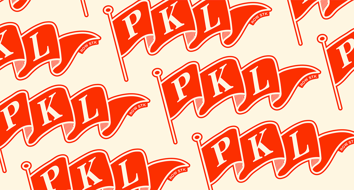
Founded in 2025, PKL Row was more than just a startup—it was a bold vision waiting to take shape. As a brand-new player in the sports club industry, they needed more than just a logo or a color palette; they needed a comprehensive brand identity that would capture their energy, connect with their audience, and set them up for long-term success.
From strategy and design to digital presence and brand applications, we partnered with PKL Row to transform their idea into a standout brand built for growth.
Services Offered:
custom branding
Website design
retail brand application
Merchandise design
Ongoing design support

PKL Row set out to redefine what a sports club could be—more than just a place to play, but a destination for community, culture, and connection. Rooted in Starkville’s vibrant energy and history, the brand needed to feel both established and fresh, appealing to two key audiences: the college-age crowd and the longtime pickleball enthusiasts who have fueled the sport’s rapid rise.
To bridge these two worlds, we developed a brand identity that merges vintage industrial influences with bold, modern energy. We explored multiple visual directions, from a sleek, contemporary look to a heritage-inspired aesthetic, ultimately combining the best of both. Rich, earthy tones, distressed textures,
and dynamic typography give the brand flexibility. The final brand is equally at home on a court, a T-shirt, or a wayfinding sign.
With the club’s location in a former steel manufacturing facility, we incorporated industrial cues throughout the design while ensuring the brand remained warm, inviting, and adaptable. A versatile system of logos and lockups allows for seamless integration across spaces, merchandise, and digital platforms, reinforcing the PKL Row experience at every touchpoint.
As the brand grows, its identity will evolve—shaped by the players, the community, and the culture that continues to define the future of pickleball.


PKL Row’s branding balances a modern, youthful energy with a refined, club-inspired aesthetic, ensuring broad appeal across multiple generations. The visual system is built around a dynamic combination of bold typography, vibrant color applications, and adaptable brand lockups that create a flexible yet cohesive identity.
The primary logomark embraces a structured yet playful feel, integrating industrial influences that pay homage to the building’s past as a steel manufacturer. A secondary set of logos and icons provides versatility, allowing for creative placements across signage, merchandise, and digital assets.
A carefully selected color palette of warm yellows, deep greens, and bold reds gives the brand a strong, recognizable presence, while textured text treatments and patterned applications add depth and character. The branding extends beyond traditional assets, incorporating a variety of touchpoints, including court graphics, wayfinding elements, and custom merch lines—ensuring high visibility and an engaging, immersive experience for visitors.
With a strong foundation in strategy-driven design, PKL Row’s visual identity is built to evolve, allowing for seasonal campaigns, community engagement initiatives, and future brand expansions while maintaining a distinct, authentic personality.
PKL Row isn’t just a place to play—it’s a destination. A home for connection, competition, and community, bringing Starkville the vibrant social hub it’s been waiting for.
PKL ROW BY SABBATH STUDIOS
Every great brand starts with a single idea. let’s bring yours to life.